stitching and drone | harmony

drone harmony layout preplanning

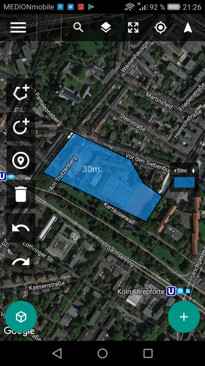
two days ago when the weather was inviting and the wind was calm i took the chance to try out a new drone app for photo professionals, still in beta, called drone harmony. the basic difference between the competing apps is simple, but impressive: before you plan your flight you tell the app where the obstacles are. the drone then avoids the buildings, trees, fences etc. you tell the app in the second step where and how to fly. maybe in a helix around a tower, or, that’s what i did, in a grid for straight down = orthogonal photography.

to cut things short: i’ll have to repeat the flight because – what i never thought about – the lighting conditions between beginning and end of flight were very different. when i took off, clouds cast soft shadows on the ground. towards the end of the expedition, ten or so minutes later, the sun came out, with sharp late afternoon shadows, confusing all four stitching apps i tried.

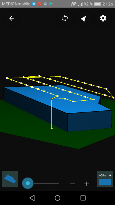
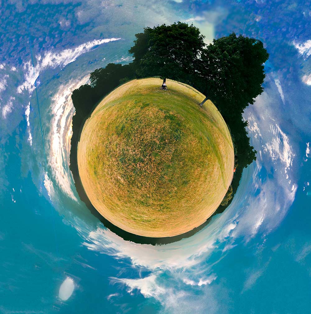
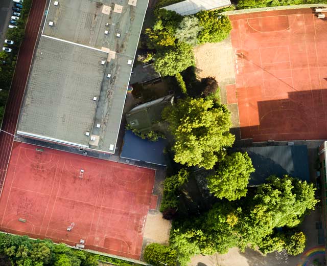
flight and photo pattern acroos the layed out area

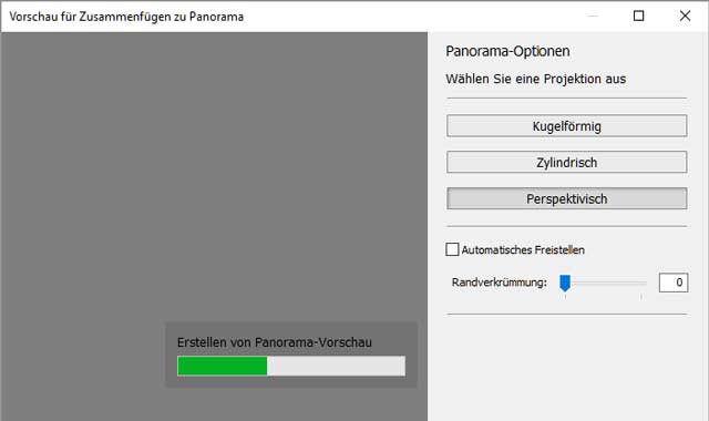
first i let adobe photoshop lightroom deal with the 44 high res raw photos. i did some colour correction and camera profiling and then asked lightroom to stitch them all together. it took ages, maybe 20 minutes. lightroom offers no option for straight orthogonal images and chooses “perspective”:

lightroom tries stitching 44 photos together.

the result was this:

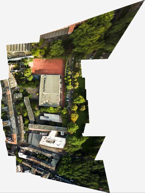
odd sharp edges (lightroom)

this attempt was not the worst, but puzzling. i could not determine where the extreme edges and distortion came from. the shape of the stitched object does only vaguely resemble the almost rectangular layout of the actual flight. next candidate: microsoft ICE.

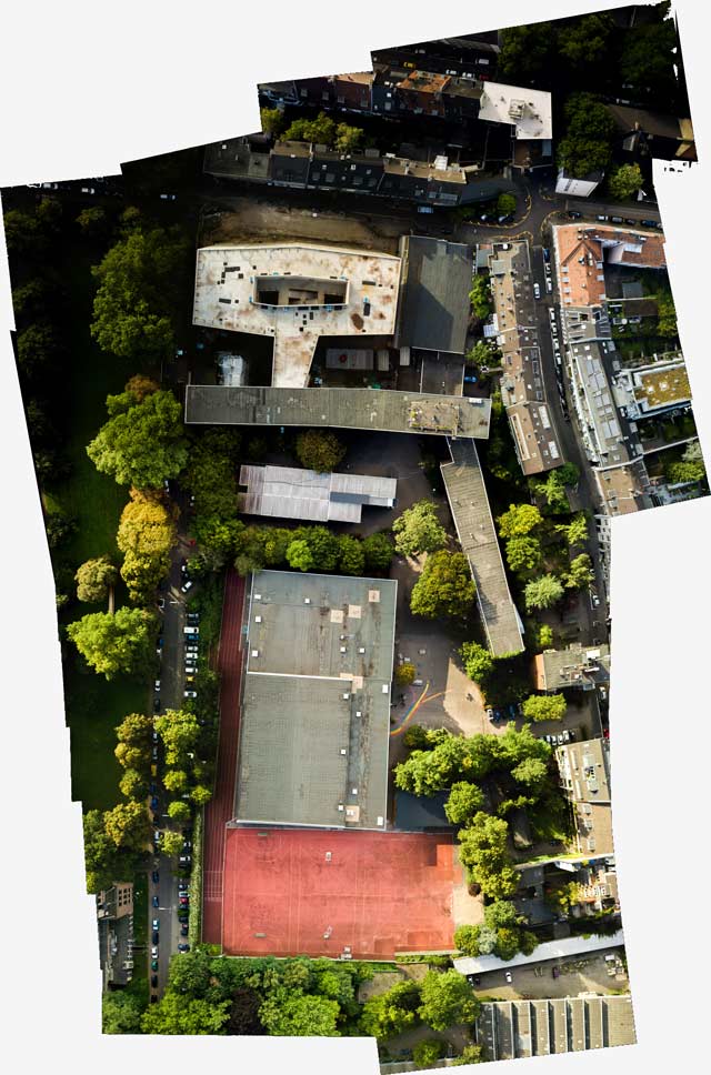
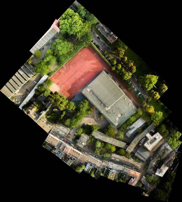
microsoft ICE stitch

microsoft ICE did a much more sober stitching. i had used it before for 180° and 360° panoramas and little planet photos. nevertheless the pretty good looking panorama is flawed:

stitching flaws in ICE

the reason for this problem is that the sports playground had different lighting conditions. the third candidate amazed me with its free inventions. you may call it creative or useless: photoshop CC.

photoshop stitching

photoshop, famous in the old days for its stitching capabilities, is a lame duck now. all it presented was the odd collage above, with pretty amazing details (below):

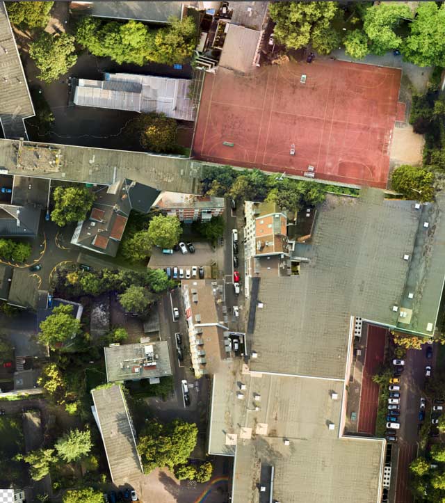
none of these buildings is at the correct position.

let’s zoom in at another section of the same stitching. photoshop thought, why not TWO sports grounds? here the problem with the different lighting situation is obvious:

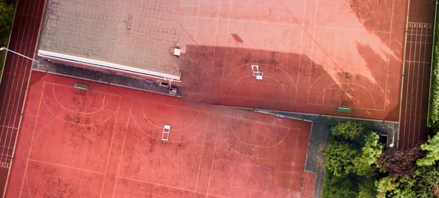
photoshop invents a double sports ground.

the creativity of photoshop is so amazing that i risked another close look. here the two sports grounds (in reality there’s only one, of course) are seperated by trees:

another attempt in photoshop

autostitch was the last software i tried – and it turned out to be the best, along with microsoft ICE.

autostitch64 does a good job.

like microsoft ICE, it handled the different lighting situations with ease, but both programs have problems with details. this is autostitch, a detail from the center of the image above, buildings which seem to fall into pieces and blend together:

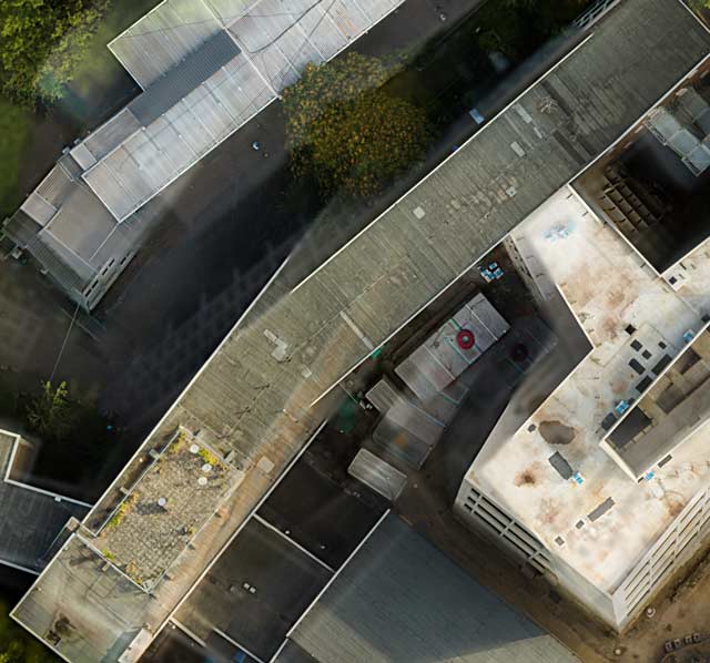
autostitch detail with lots of problems

so, i’ll have to do the flight again and see…


in the meantime, two years later, with better stitching software, i could solve the problem. see → here.

riesengroßer little | planet

little planet panorama. foto: ms/dpa

wenn man viele bilder zu einem gesamtwerk vernäht, wie bei einem panorama üblich, entstehen große dateien. in diesem fall zwang das in microsoft ICE zusammengesetzte bild meinen rechner in die knie. das stitching (vernähen) selbst ging noch einigermaßen flott vonstatten, aber der import in photoshop dauerte ewig, lightroom lehnte das panorama von haus aus ab, weil zu groß.

ich sah also nach und fand die verblüffende bildauflösung mit übe 50.000 pixeln breite. das bild belegte in photoshop 5 GB arbeitsspeicher, und weil mein rechner zuhause “nur” 4 GB hat, scharrte sich das programm mühsam speicher auf der festplatte zusammen. jeder bearbeitungsschritt dauerte gefühlt 5 minuten.

anyway. hier oben ist es, gezähmt. → little planet, aufgenommen gestern. und unten ein detail aus dem → nadir (bildzentrum), um die auflösung besser beurteilen zu können.

little planet übrigens: da gibt es immer den tipp, ein paar schön hohe objekte zu haben und nur minimal über den horizont zu gucken. das habe ich hier versucht, indem ich die drohne niedrig fliegen ließ, etwa 3 meter, und nah an den zwillingsbäumen.

detail aus dem nadir des obigen panoramas


die dunkle seite | des hellen

in anlehnung an die grafik mit dem zugenähten mund → eine etage tiefer ein weiteres spiel mit dem dunklen. dieses bild sieht düster und blutig aus, als wäre ein verbrechen passiert:

gabrielMetsu_bloodStainedfoto mit blut in gemälde von 1664 kopiert

dabei habe ich auch hier nur das foto einer wunde (wiki commons, foto einer vernähten wunde von carsten niehaus) mit dem befehl “ineinanderkopieren” auf ein an sich ganz harmloses, ja sonniges bild gelegt. es stammt von dem niederländischen “sittenmaler” gabriel metsu:

gabrielMetsu_womanReadingALetterdaniel metsu: dame beim lesen eines briefes, ca. 1664

seit es programme wie photoshop und ebenen gibt, um nicht-destruktiv zu arbeiten, haben bilder ihre autonomie verloren. [einige sagen, sie hatten sie noch nie, ihre autonomie, weil zum beispiel ein filmnegativ beliebig ausbelichtet werden konnte, hing von den chemischen substanzen und wartephasen ab.] ich habe das originalgemälde genommen, einige bereiche daraus ausgewählt und in eine ebene darüber gelegt. diese bereiche (die gesichter der beiden frauen und der brief in der hand) sind damit geschützt. eine eben drunter, das original, konnte ich nun mit zwei klicks a) abdunkeln, b) die farbsättigung verringern, um noch mehr leben aus dem bild zu nehmen. es wirkt nun völlig anders. das kam nach gefühlten 2 minuten dabei heraus:

gabrielMetsu_womanReadingALetterDarkdas bild von oben, mit geschützten hellen bereichen, der rest dunkler und farbloser

grünheinichen | tarnen und täuschen

bei ebay versteigert ein mensch aus grünheinichen (wo liegt das wohl?) zurzeit ein “fotoalbum leder von 1890”. wenn man weiß, zu welchem preis heute fotoalben mit so alten bildern gehandelt werden, wundert einen das startgebot von 9,99 €; und kurz vor auktionsende noch kein bieter.

fotoAlbum_vollfotoalbum leder 1890

der grund für den niedrigen preis ist der, dass ich oben einen trick angewandt habe, fünf minuten photoshop elements (“in die auswahl einsetzen”). die menschen am strand stammen aus ganz anderen, ebenfalls gerade bei ebay angebotenen 100 jahre alten fotos. in wirklichkeit sieht das angebot so wie unten aus. sorry für die verwirrung:

fotoAlbum_leerdie wahrheit, leider.

eigentlich schöner, das leere fotoalbum. erinnert an … blinde fenster. warum? … wegen dem bogen oben und dem rahmen drumherum. also, ganz billig gemacht, die konsequenz:

fotoAlbum_strassestraßenszene mit leerem fotoalbum

die frühe fotoalbumzeit orientierte sich an den fenstern der häuser – woran auch sonst! gab ja vorher keine fotos und auch keine alben. erinnert ans radio. als die rundfunkempfänger aus dem bastelzeitalter herauskamen, so um 1930 herum, sahen sie aus wie kirchen, kirchenorgeln oder repräsentativgebäude.

fotoAlbum_radiogloria lumophon von 1930. → geschichte des radios